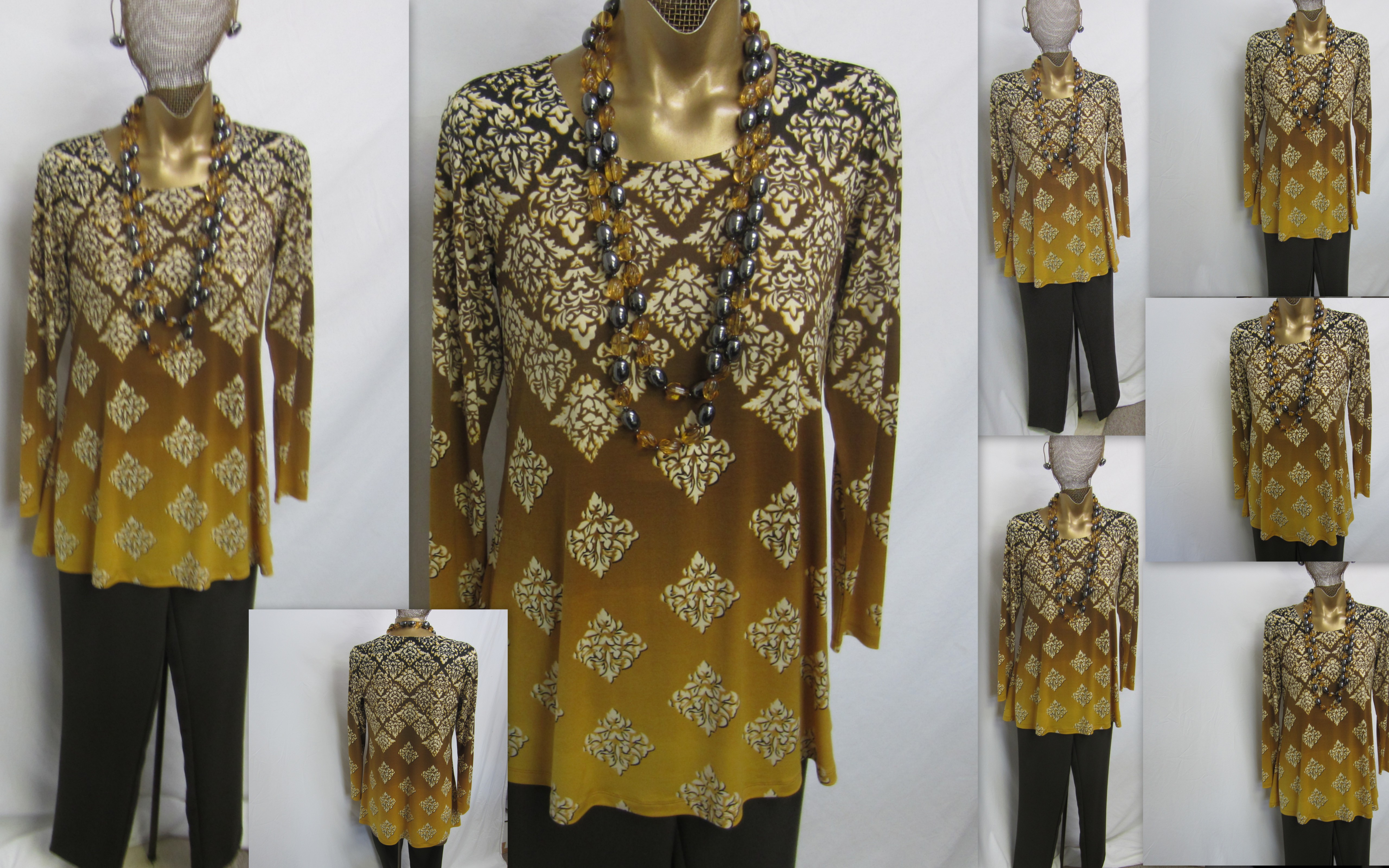
……………….The color is being called OLIVE, and it is a deep Olive at the top, but the major color is a wonderful rich OCHRE………It’s a golden color that keeps changing, and becomes CITRINE as it descends to the hem. The OLIVE SLIM PANT, A259702 is the perfect compliment…….I know there will be questions about the necklace. It was an alternative color to the root beer/gunmetal……we went with the root beer and dropped the citrine, so it’s just for inspiration…..you can always go with your Gunmetal beads, Black beads or your spaced Jet necklace which will be perfect………This is a very special color, and it may not be for everyone….but if you know this is for you…..it is a wonderful unique color, and you will look unique wearing it……………………………………………enjoy………………………………much Love…………………………………………………….Louis
I love your tops in this fabric – I usually order every colo! Went to qvc and they say this top is no longer available! Any idea, or did I miss it? Thank k you Louis – your clothing always makes me look and feel elegant!
Dear Ramona…..I have no idea why CS gives that answer when it isn’t correct. My sneak peek photos show what is to come on my next shows, so they aren’t in the system yet, but that doesn’t mean that “they are no longer avail” which implies they once were, but they are now gone. They haven’t been sold yet so you haven’t missed them……They will be on one of my Jan 30th shows at 11am or 6pm….hopefully.
Beautiful! I actually see a Polynesian influence in the print. I’m leaning toward this one myself, although the blue is so tempting, too. Looking forward to the January/February shows. They are some of my favorites of the year. We’ll be wearing spring here before you know it.
crdlb
Louis, I’m a “pink” girl (actually a fuchsia girl!) but this olive/citrine really appeals to me. Love the print and the style. I see this color and the raspberry in my future!
P.S. — Looking closely at the medallions, I sense a Japanese influence, like stylized chrysanthemums. Love!
Dear Jane….I’m happy to hear that. It’s probably the least commercial color of the 4 which of course makes it one of my favorites, because it’s special and will appeal to a more limited audience.Honestly they are each unique because each coloration is very special with the ombre.