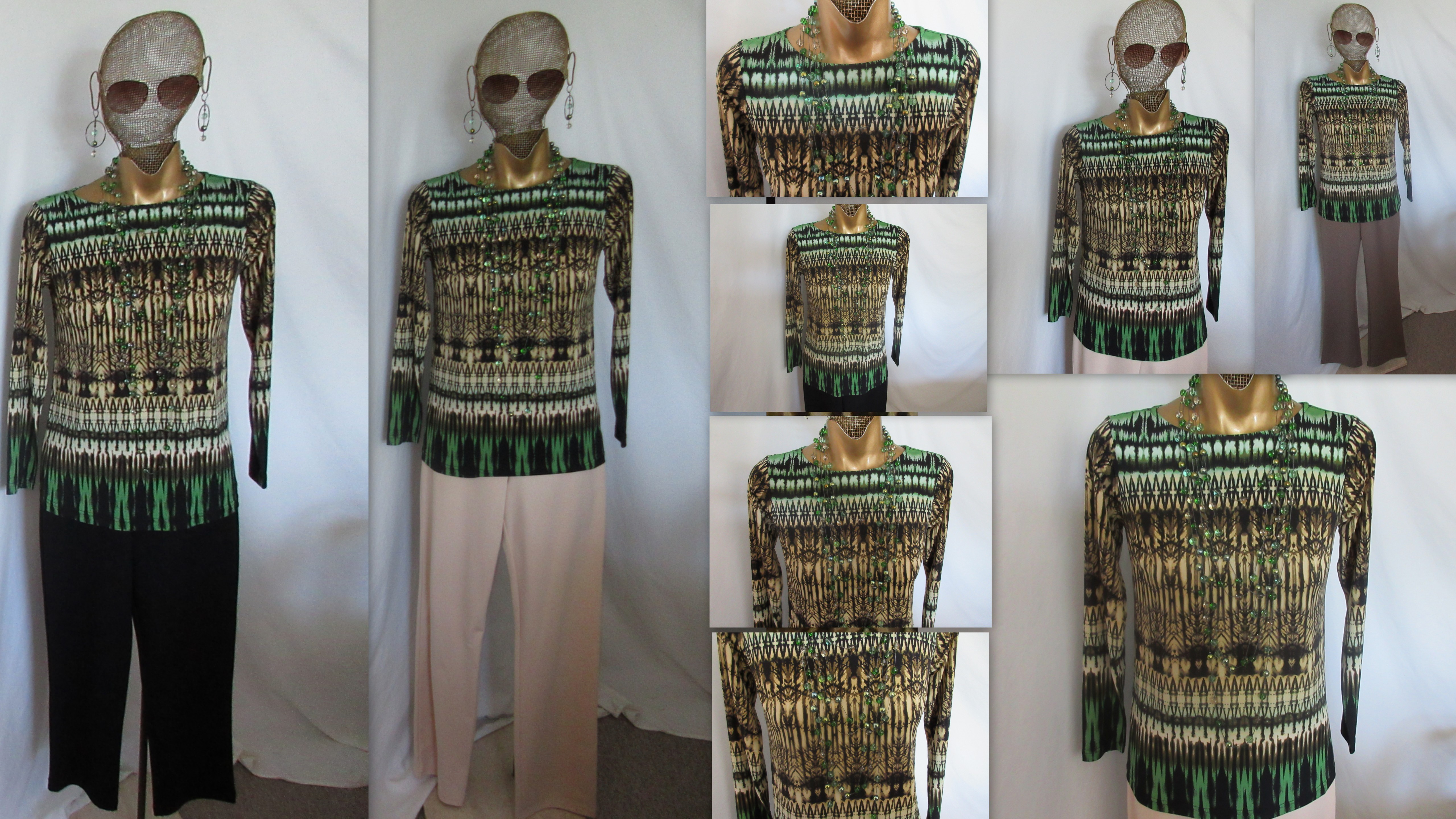
……………….,..The ALMOND Cathedral Print is the most neutral of them all. It has ESPRESSO detailing with ivory, beige, almond, and alabaster colors. The deeper spearmint blue green and mint are the accent colors…….I have it shown above with two different bottom colors. They are both the Super Ponte Boot Cut pant in the Alabaster [for spring], and the new Espresso for all year round. Perhaps you have my WALNUT JEAN CUT PANT? It works perfectly with all the tops that have the Espresso in them….. The ALMOND CATHEDRAL NECKLACE & EARRING is used to perfectly accessorize the top. I have found in playing with all of these necklaces they work with so many other things…………………..enjoy…………………..much Love…………………Louis
Louis – I will be happy to eat with you at the Outback.
Thanks Donna, but I won’t be going there anymore!!! LOL
Louis…you mentioned in your first post that we may see different things in artwork. When I first looked at this top, I thought “Tiger Print!” We all need to unleash our “inner tiger” from time to time. I like this one too, along with the fuchsia.
Rudewarr and I are on the same wavelength today (not kidding). A few moments ago I dropped a post on the Linea forum in which I chided you, a “designing genius,” for always throwing temptation before me. Then I hopped over to your blog and scrolled down through your offered colors of this top. When I arrived at Almond, I concluded I would get the Blue and the Almond. Finally, I clicked on “Comments” and I see that Rudewarr and I are in total agreement.
Love the almond and the blue! The almond with the new espresso suede boot cut pants and trench…instant outfit! I already have your navy Ponte pants and skirt, perfect for the blue. Oh how I love when things come together and so effortlessly!!!
You are a true genius!