Colors con’t
What new color would you like for the embroidered skirt. As of now the plan is to bring back Latte.
Continue Reading
Colors con’t
What new color would you like for the embroidered skirt. As of now the plan is to bring back Latte.
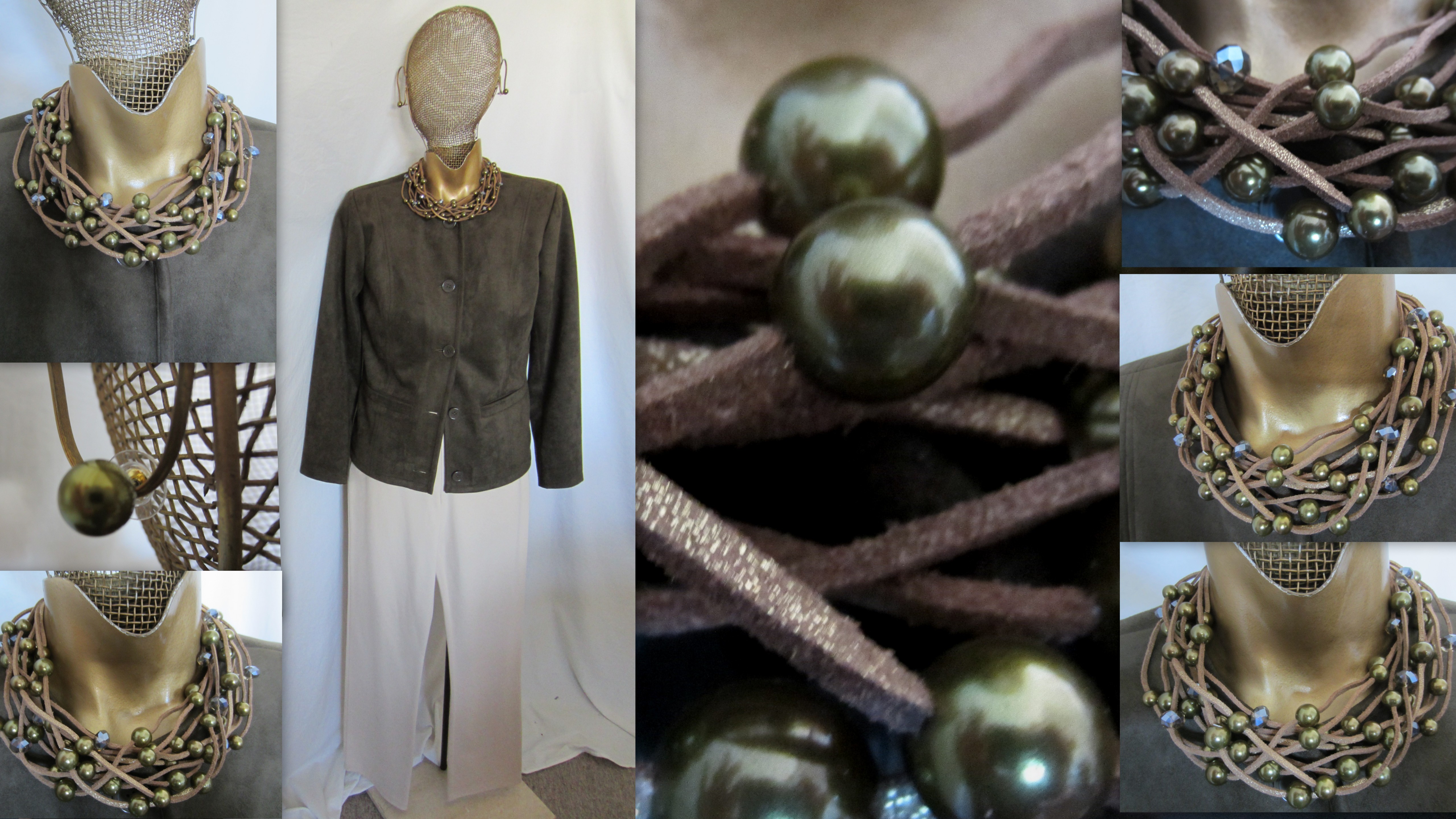
……………………….Why did I choose the name SANTA FE?………….There was something about the rustic SUEDE cord in the GOLD WASHED BROWN color that reminded me of the south west. The LODEN PEARLS and FACETED GLASS beads are the color of cactus……With each piece I design I feel it should have a purpose and a difference from anything else Linea you may own……………This is a very unusual torsade, and a wonderful addition to your Linea collection. It is posted on the Linea Jewelry QVC site for all other information……………………………………………..
enjoy………………..much Love…………………….Louis
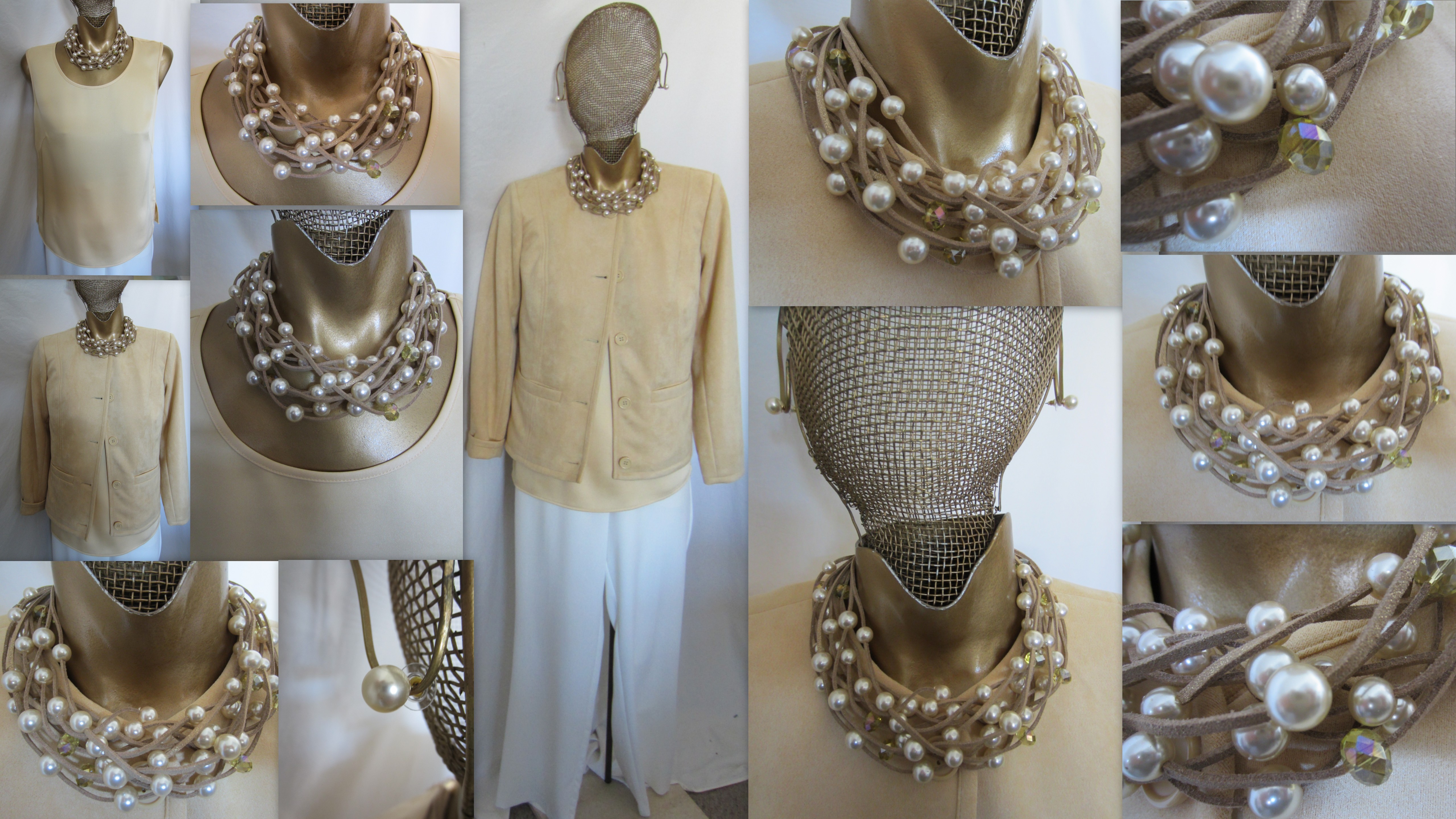
…………………………….BUTTERCREAM is the second color being offered in this SANTA FE necklace and Earring…….The pearls are cream, and as close to a buttercream as were available……..The faceted glass beads have an iridescence with pale yellow and pink being highlighted with the lights reflection……..Here the suede cord is in a natural paler color, again brushed with gold…….I think you will find this a very versatile piece, and it will look just as good with a summer tee as it does with the buttercream faux suede jacket…………….enjoy……………….much Love……………………Louis
I believe the LONG TRENCH COAT and the TUXEDO jacket will be reordered for next Late Fall. What colors in the trench would you like to see returned and what new colors added. For the tuxedo what new colors would you buy? Remember it can not be done in IVORY or WHITE, and the satin must always be BLACK.
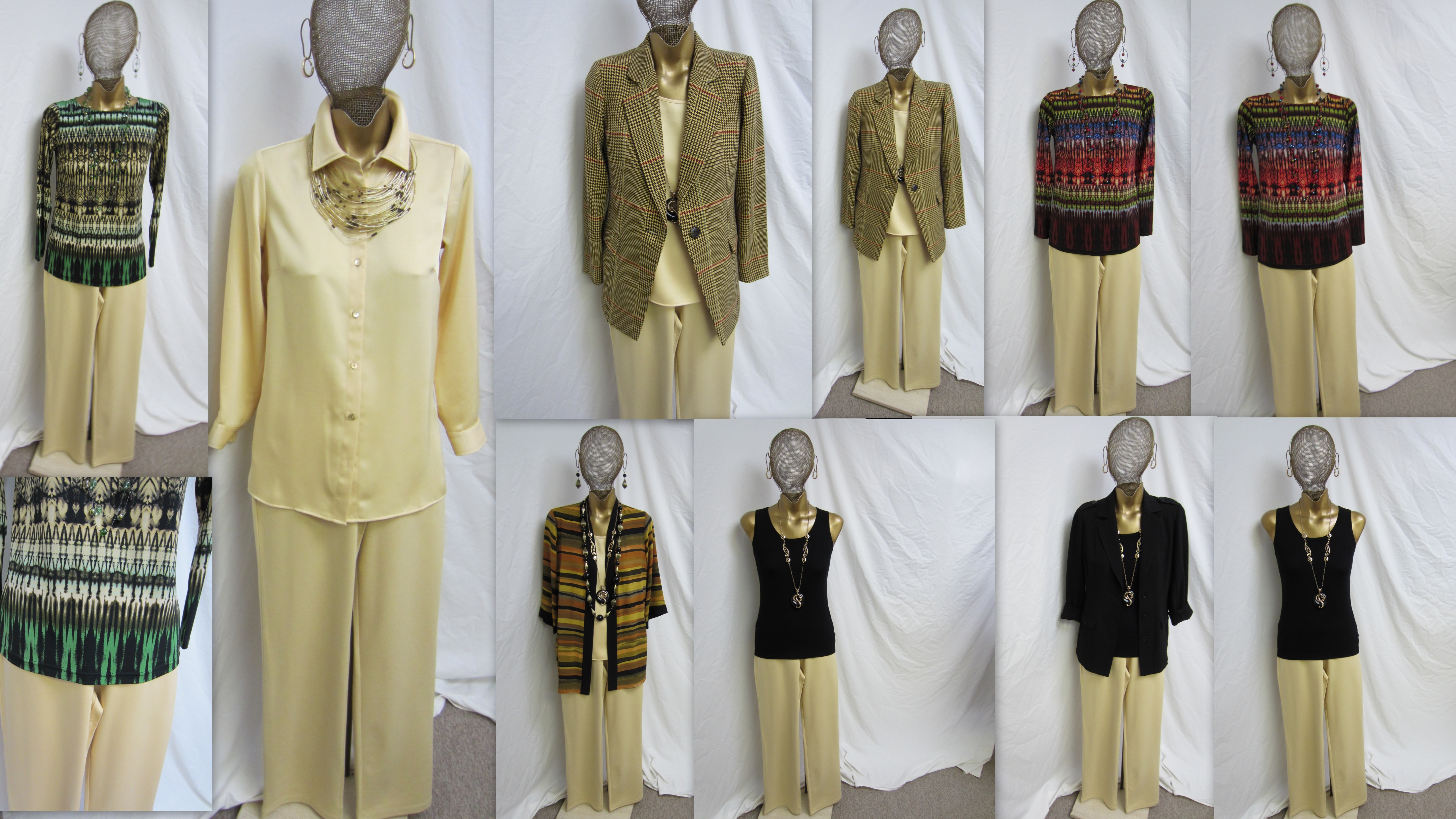
……………………..I’ve decided to do a sneak peek on the BUTTERCREAM SUPER PONTE BOOT CUT PANT……I think there are categories for pant colors. BLACK has its’ own because no one has to think if a black pant will work in their wardrobes, that’s a given…….Then there are the second tier colors, or the classics such as NAVY, GREY, WHITE and IVORY. The third tier colors are colors everyone should own, but sometimes question if they need them….like OLIVE, ESPRESSO, KHAKI, CAMEL, DK FOREST GREEN, WINE, PORT etc. They are neutral colors that can work with many things. Then there are the fourth tier colors. All of the so called “fashion colors” such as pink, sapphire, red, yellow, green, alabaster etc etc. I put BUTTERCREAM in this fourth tier, because it is a color that many woman will find hard to imagine mixing in with what they own……So…..I decided to to show, in pictures, a few different ways to mix buttercream with things you may own. Starting at the left you have the Cathedral top in Almond, The matching Buttercream satin shirt [coming in Feb.], the Yellow plaid blazer, the Desert kimono, the Spice Cathedral, and the Black tank and gauze crepe blazer……I think you will find Buttercream can be a beautiful soft neutral color. It can become an easy option to mix with what you own as the Alabaster, and Linen color pants were. There are so many solid colors that will also look great with BC……navy [wonderful with buttercream], grey, pink, aqua, lavender, red, khaki, chocolate, to name a few…….So when you evaluate Buttercream think of it as neutral color and not just a “fashion” color……………………enjoy……………………much Love…………………….Louis